Novaterra
Brief
Branding & Packaging Design
Briefing
Brief analysis and development through two distinct graphic approaches
Novaterra produces materials for the green and garden industry. Among its products, the company has developed a hemp-based flour: a lightweight ingredient rich in nutritional and plant-based properties, designed to improve leavening and achieve a 100% organic final product.
Brief
Branding & Packaging Design

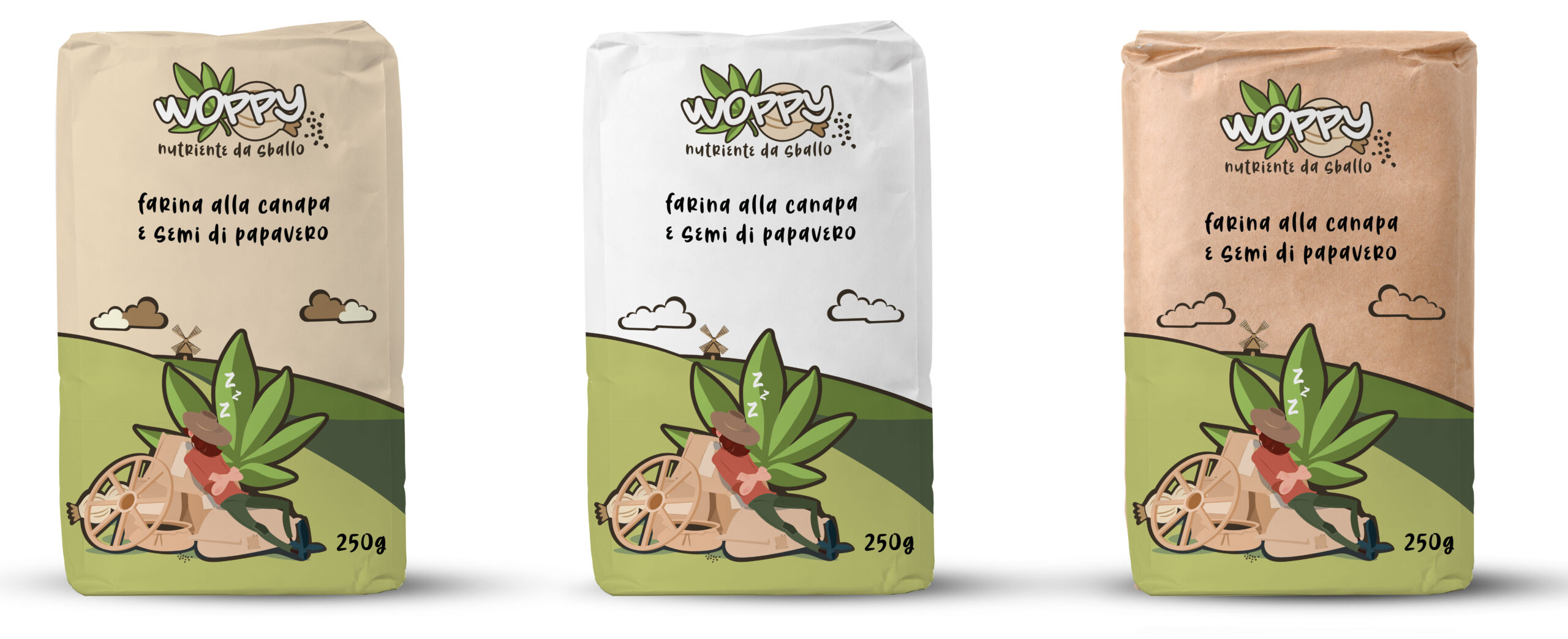
Woppy Variant
Playful and light tone of voice
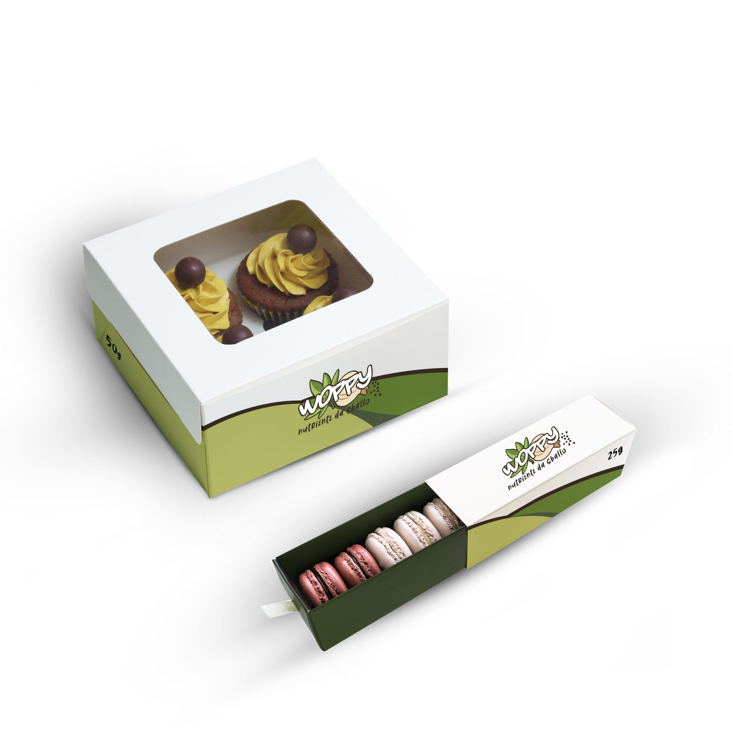
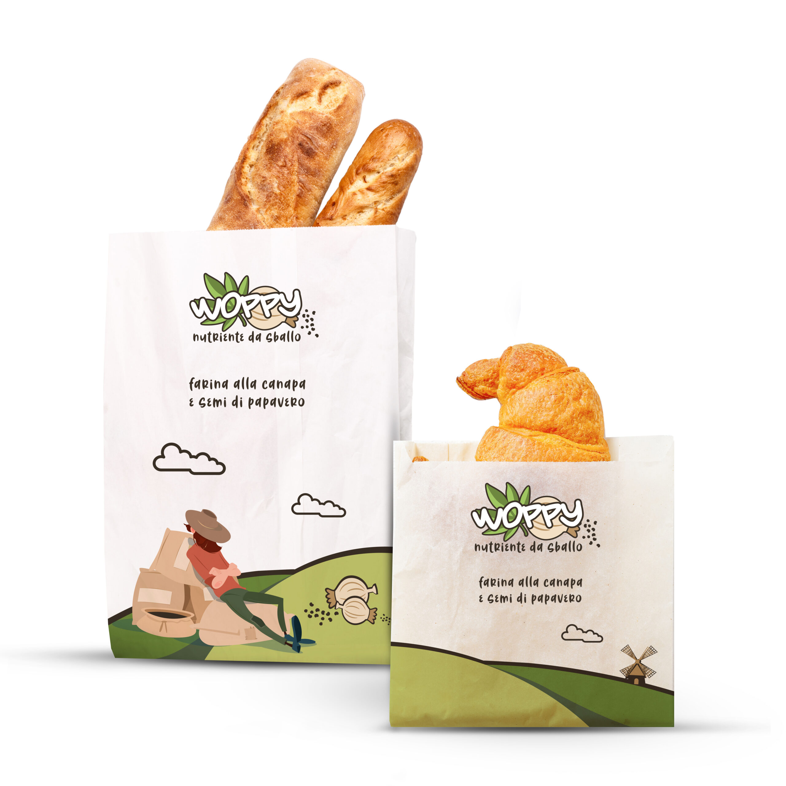
The graphics are developed in consistency with the WOPPY visual identity, reflecting its values and tone of voice.
The language is easy-going and relaxed, represented by a farmer resting on his cart—symbolically rejuvenated by the benefits of the flour’s main ingredients: hemp and poppy seeds.
The setting depicts a rural landscape of fields, hills, and windmills—elements that evoke authenticity and a strong connection to the land. Classic white paper was chosen to enhance the illustrations and brand messaging.
The project targets Millennials, featuring a bright color palette and a reggae-inspired illustrative style. The visual reference to rolling papers further defines the stylistic identity, maintaining continuity with the logo concept.
Brief
Branding & Packaging Design
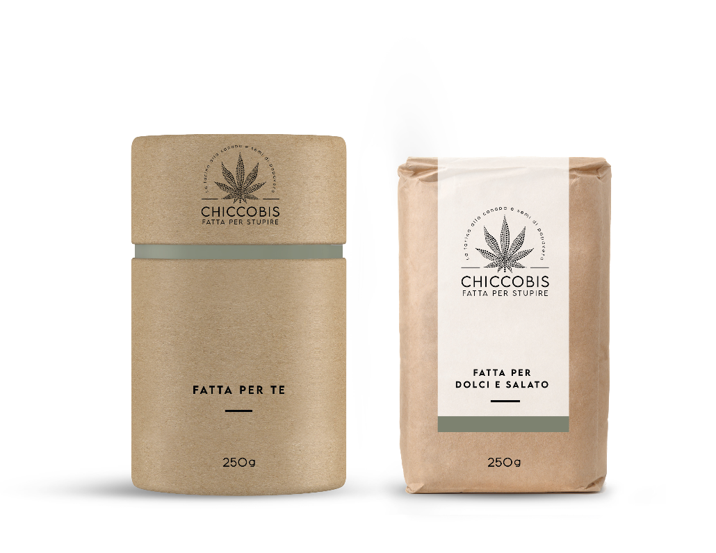
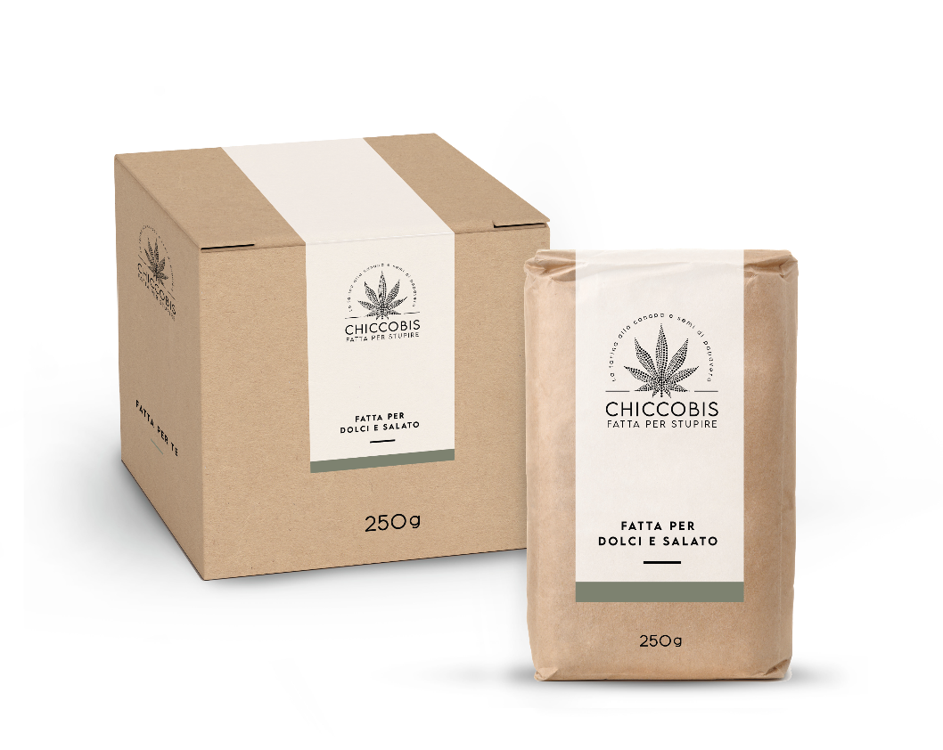
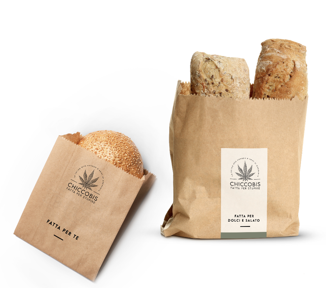
Chiccobis Variant
Minimal and modern style
This proposal aligns with a minimal and elegant style while maintaining an evocative and adventurous spirit. The various packaging designs are distinguished by meticulous attention to detail while preserving strong overall visual consistency.
The unifying element is the harmony between shapes, spaces, and graphic content. Here, the choice of material is central: eco-friendly Kraft paper recalls the raw burlap sacks historically used to transport fine spices, pepper, and tea by sea.
This material and cultural reference strengthens the brand story and guides the graphic choices, contributing to a solid, authentic, and recognizable brand image.