Cantina Tollo
Branding
Packaging Design
Branding
Brand Identity
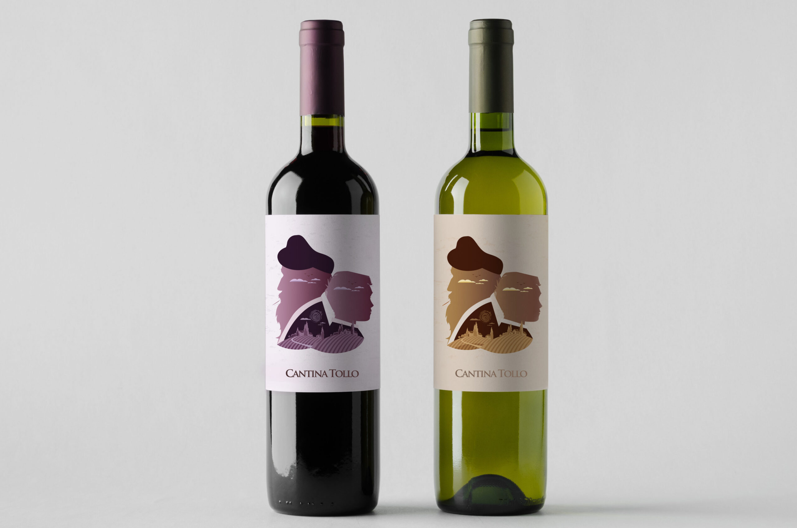
I designed a series of limited edition labels for Cantina Tollo, developed for both white and red wine selections.
The illustrations were created using a flat design technique, aiming to keep the visual elements as clean and sharp as possible. This approach enhances and emphasizes every single detail and the core concepts behind the creative idea.
Wine is crafted, among other things, from an extremely precious element: time. For this reason, my project unfolds as a journey through the world of wine, paced by time and the earth—the territory that time itself shapes and where the wine takes form. In this perspective, wine becomes the result of an idea, an experience, and the shared knowledge of an entire region.


Branding
Packaging Design
Packaging
Tradition thus becomes a certainty—perhaps the only one that truly endures
Time flows, yet it appears suspended in the eyes of the protagonists: the village remains unchanged, the landscape constant, just like the flight of the birds. In the background, the profound value of family ties emerges. The two characters represent a grandfather and his grandson, united by their passion for their craft and their land.
Simultaneously, they can be interpreted as a single character, always dressed in the same way, symbolizing continuity and the passage of time as a deep-rooted bond with one’s heritage.